
Savards LLP
Services
Brand Strategy
Brand Identity
Website Design
Objective
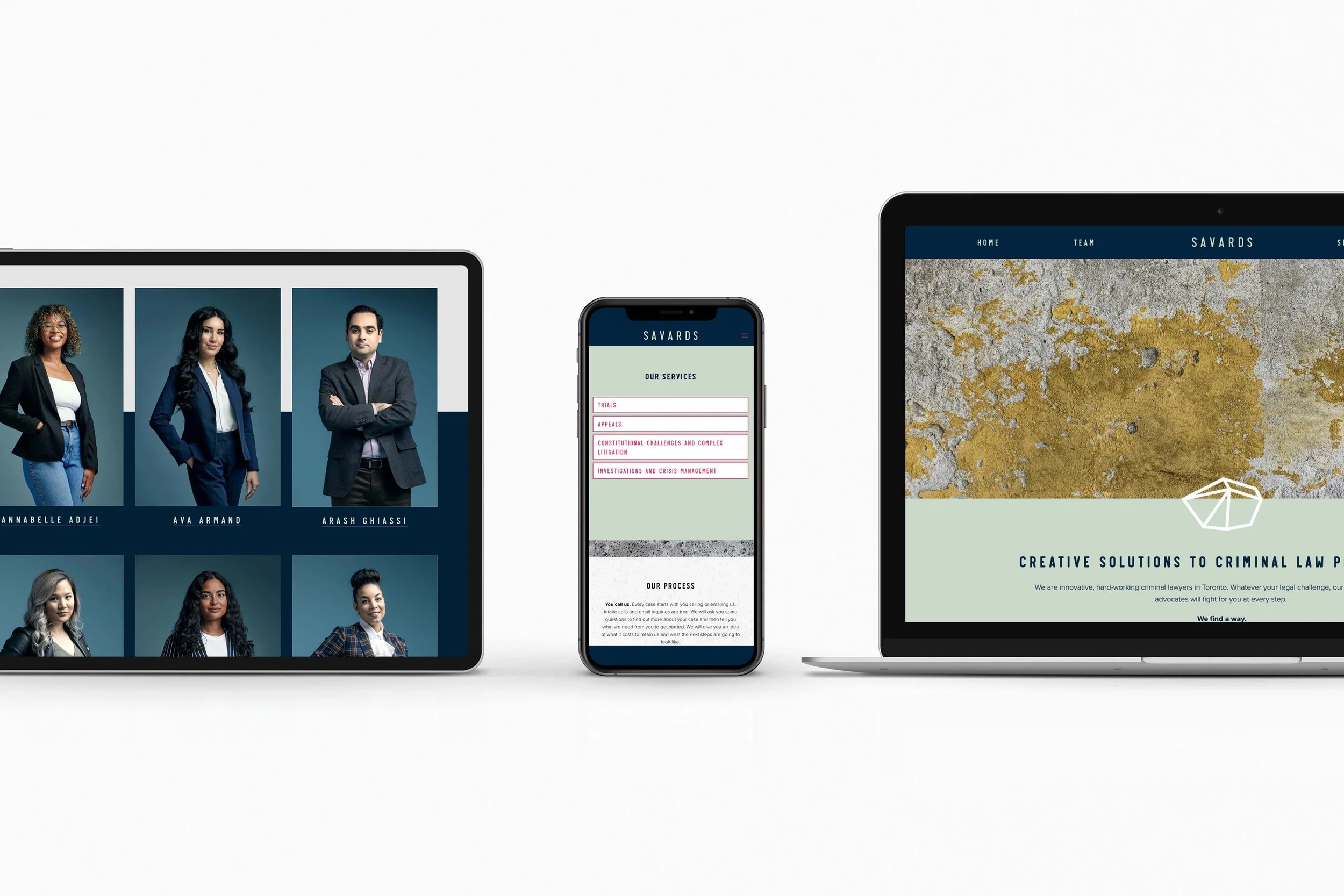
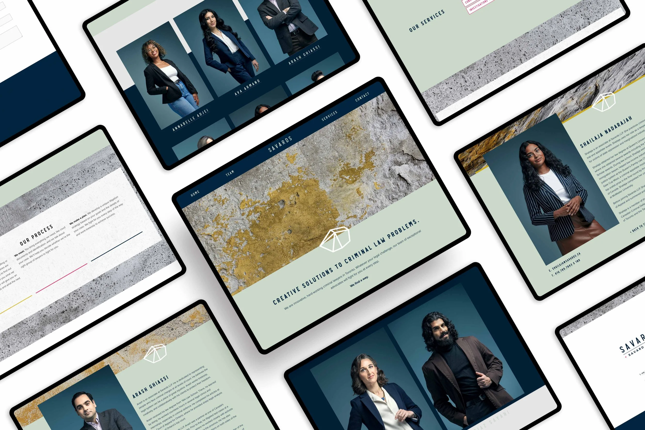
The main logo icon is a geometric stone meant to symbolize the story of David and Goliath. Within the logo icon rock, we “hid” the founding partner’s initials S + F. Everything from the colour palette, portraits and website were all inspired by a bold and scrappy mindset. Deep navy and cool mint provide a backdrop for intense hits of fuschia and golden rod.
Overview
Savards LLP has become one of the leading criminal defence firms known for its ability to give the underdog a powerful voice in what is otherwise an imbalanced fight. When we first met about the firm (at the time Savard Foy LLP) to craft the brand identity, the goal was to communicate their respectful, empathetic and collaborative approach to criminal law.


The System
Strength. Determination. Innovation. The Underdog. The logo system signifies these brand values. The logo typeface is a family of sans serif fonts designed with a vintage letterpress print look in mind. Set in uppercase, there is an unmistakable confidence. Rounded edges and imperfections were added to the characters to give that old-school, scrappy hand-printed vibe.


M81 was immensely helpful in establishing the business plan and crafting our brand identity. The final package exceeded our expectations.
Savards LLP

