Pop-Up Chapel Co.
Services
Brand Strategy
Brand Identity
Website Design & Development
Overview
The Pop-Up Chapel is the originator of shared-concept weddings. After 10 years in the game, they wanted to find a way to better communicate their time, experience, and quality of services.
They are both a serious service provider and a fun alternative to traditional weddings. We wanted to find a way to signal, “Hey! We’re a fun, creative, fresh and fully-tailored approach to saying I Do!”
Objective
Be more expressive and find a way to communicate the large personality of this brand. Colour is not just about decorating. It is arguably the simplest tool we have to enhance positive emotions and increase well-being. Previously limited to 2 colours—it was difficult to create a range of emotions. The new palette is bright, warm, energetic—and offers endless combinations.
The brand fonts were fine-tuned to balance all aspects of their personality. Bold, modern, and expressive. Euchre is a joy to read, with comfortable proportions and a dependable open structure. But it’s real charm comes from its perfect balance of contrast, just enough to make words sparkle but not dazzle.


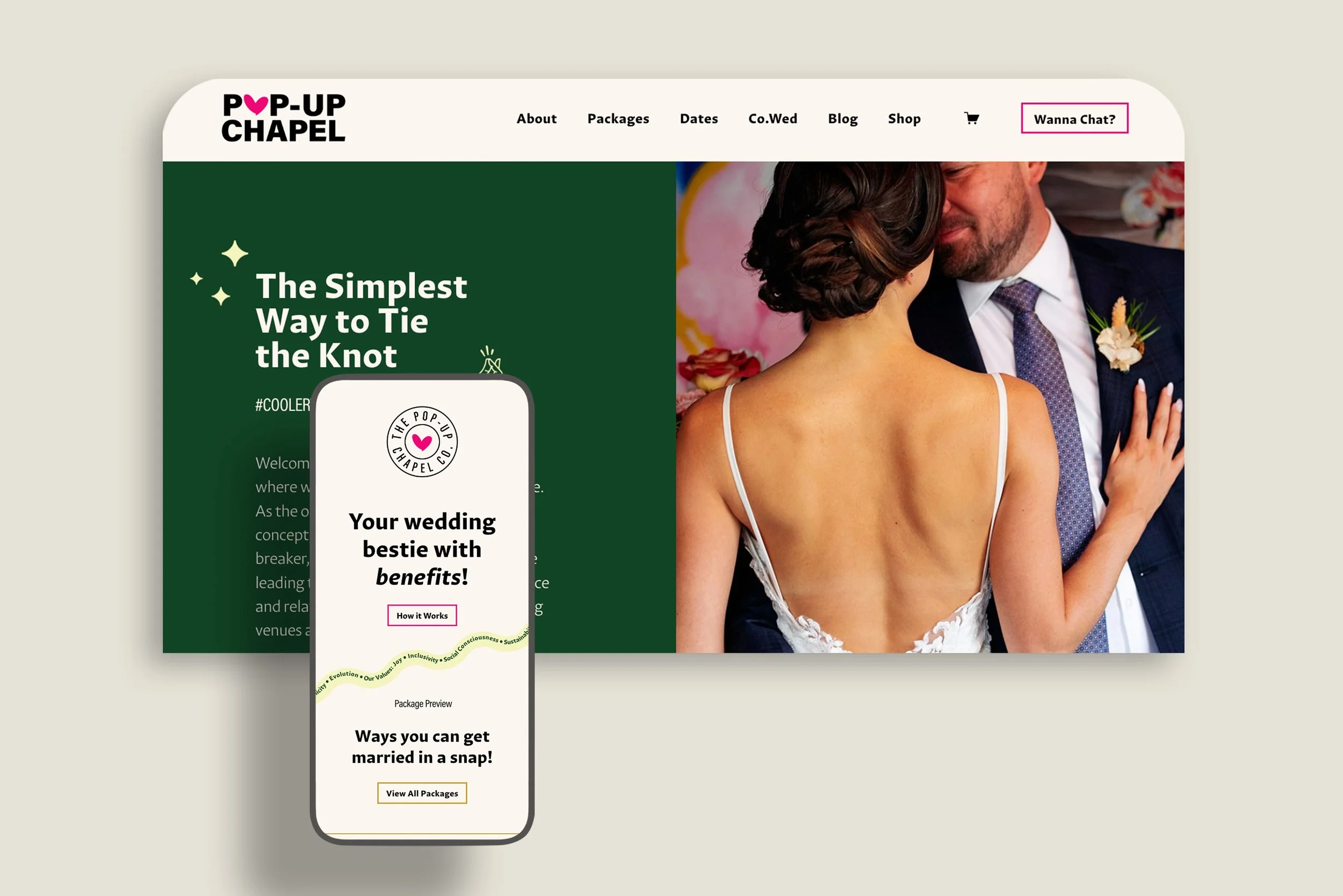
Website
The website was an important platform to express the brand’s new personality. From clever hover effects to scrolling animations and a custom confetti video—the entire experience feels like a party. We wanted visitors to easily navigate package options and book a free information session to learn more about planning their perfect pop-up wedding.


